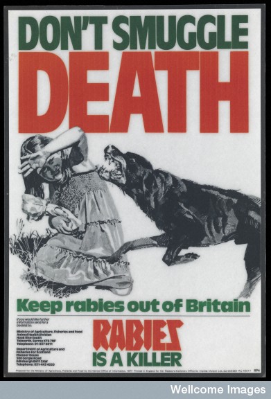
Some things just don’t date well. Although public health communicators have used posters to put across their messages since the invention of the medium, the combination of images and words used can seem rather strange to us now. Take, for instance this poster from 1977 which is intended to warn the public of the danger of rabies:
Wellcome Library, London. Poster advertising the dangers of rabies, 1977
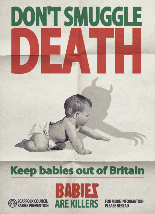
The poster clearly plays on fear and the danger that rabies could pose, especially to children. And as has been pointed out by Ross MacFarlane at the Wellcome Library and historians Neil Pemberton and Michael Worboys, there are other fears at work here too, such as concern about Britain’s relationship with the rest of Europe. But the poster’s message seems so uncompromising and dare I say it, unsophisticated, that to an early 21st century eye, it’s almost laughable. Indeed, the tone of the anti-rabies message has been subjected to parody by the Scarfolk blog, a website that deliberately parodies public information posters and publications from the 1970s:
Scarfolk ‘Babies are Killers‘, January 2014
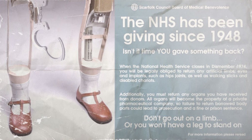
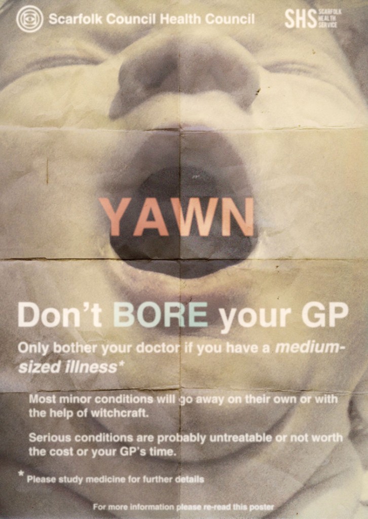
And it’s not just posters about rabies that are open to parody. Take these images, again from the Scarfolk site:
Scarfolk ‘NHS Organ Returns’, February 2014
Scarfolk, ‘Medium Sized Illness’, February 2013
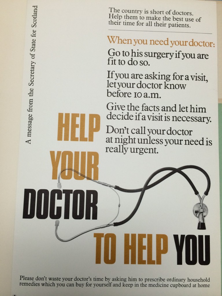
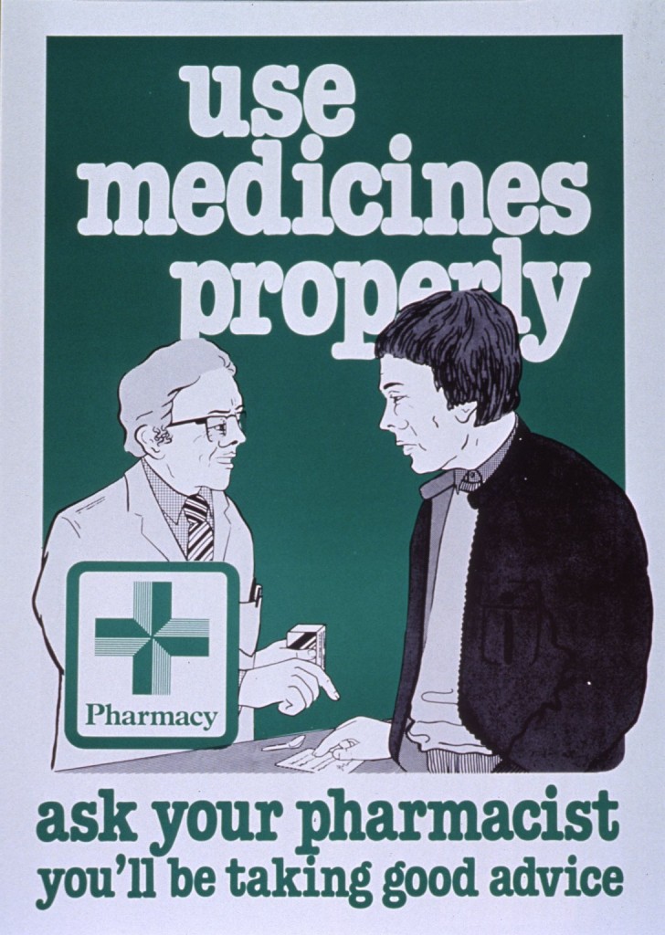
But these aren’t a million miles away from ‘real’ posters that were intended to communicate prudent use of the NHS:
Photograph of poster in The National Archives, INF 13/202, c. 1970s
Poster produced by the Royal Pharmaceutical Society of Great Britain, 198?. Image in National Library of Medicine Collection.
Indeed, this isn’t a concern that has gone away – see for instance the recent campaign to get people to call 999 for life-threatening emergencies only.
So why are these posters so open to parody? There’s nothing amusing about rabies and the problems of NHS resources aren’t exactly a laugh a minute either, but the ways in which these posters communicate their messages seem clunky to a contemporary viewer. Have we become more sophisticated in our appreciation of visual techniques, or, like hairstyles, do some modes simply go out (and in?) of fashion?
Alex Mold, 27 October 2014

